


Table of Contents
Are you struggling to grab the attention of customers while selling your food products? Put an end to your hassle by relying on creative food packaging designs. How you design food packages influences taste expectations and buyer purchasing decisions, even without tasting your food.
By choosing the right packaging designs, you trigger customers’ subconscious neurological and emotional responses. Read this blog to navigate through the unique packaging designs that turn your food contents into an implicit “salesperson” on the crowded shelves.
Why Do Small Food Businesses Need Packaging Design Ideas?
Before jumping right into creative food packaging design ideas, understand the importance of design. Whether you are selling food on crowded retail shelves or on delivery apps, choosing an irresistible packaging design makes your products pop and stops scrollers on delivery apps.
Designing custom packaging boxes clearly communicates your brand identity, core values, e.g., organic, locally sourced, family-owned, and what makes your product unique. Not only this, but professionally and aesthetically designed boxes, bags, or pouches turn your food packages into a memorable, shareable experience that builds customer loyalty.
Minimalist Typography Speaks for Premium Food
In the premium food sector, luxury-conscious foodies are becoming more interested in minimalism. Because it redefines status away from loud extravagance to refined “quiet luxury” that Gen Zers crave.
For modern consumers, boasting is out; curation is in. That’s why minimalism represents a new standard of status that whispers rather than shouts. Talking about examples, premium brands like Chobani use soft curves to feel warm and approachable while keeping the layout extremely uncluttered and clean using rounded, lowercase, bold sans-serif.
This way, luxury custom gift boxes for brands with minimalist designs and clean fonts give your luxury food items a visual pause in a crowded grocery aisle. They let customers focus their eyeballs on essential details like the brand name, flavor profile, or origin.
Clean fonts such as geometric sans-serifs or modern serifs scale perfectly across all touchpoints, whether printed on a high-quality matte box or displayed on a digital storefront.
Playful Design Elements Ensure Quick Bites, Big Flavor
If you can turn your meals into a game, you win the hearts of modern foodies in the long run. Through bright color psychology and unboxing mechanics, many food brands create highly memorable, impulsive dining moments. They stimulate consumer appetite and boost overall engagement.
You can utilize custom tuck packaging boxes with high quality printing for this purpose. This is because they transform from simple wrapping into a playful, engaging experience through interactive elements, vivid typography, and immersive storytelling.
Instead of traditional layouts, tuck packaging boxes feature eccentric fonts, vibrant color splashes, and conversational copy or even mini-stories printed inside the top flaps. They deliver a quirky unboxing moment.
Take inspiration from brands like David’s Tea, which use folding tuck boxes for delicate macarons, pastries, and loose-leaf tea tins. Their buyers save and share their unboxing experiences on social media, boosting brand recall.
Vintage and Retro Designs That Let Foodies Taste The Tradition
Gen Z is obsessed with nostalgia in the digital overload era. They crave nostalgic food as they let them revisit childhood foods, offering low-stakes joy and emotional grounding. That’s where vintage and retro designs cut through modern minimalism and establish an emotional connection with modern foodies.
Since the younger generation is drawn to authenticity, unique identity, and sustainability, you should leverage retro and pre-owned aesthetics. You can choose vintage-inspired designs that often mimic handcrafted details, old-school craftsmanship, and traditional materials. This subtly communicates durability, heritage, and high value to young consumers.
When they see familiar, retro-inspired visuals, they associate those positive emotions directly with your brand. For example, Pepsi revamped its visual identity with a bold nod to its 1990s retro logo, blending modern aesthetics with 90s nostalgia.
Another classic example is Hershey’s, which uses vintage wrappers for its classic milk chocolate bars. They let their millennial and Gen Z customers tap into early 20th-century typography and distressed packaging.
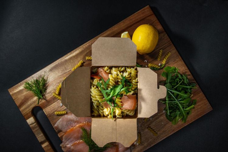
Biophilic Designs That Reflect Purity and Simplicity
The demand for deep sustainability, ingredient transparency, and authentic brand storytelling is emerging among foodies. Respecting their choices, you should adopt biophilic design. The nature-inspired aesthetics of biophilic packaging visually communicate your product’s eco-friendly credentials, which customers appreciate.
Apart from sustainable transparency, these aesthetics provide customers with a calming, tactile, and highly shareable digital experience. As customers highly prioritize the environmental impact of their purchases, biophilic designs complement that.
So you can use earthy tones, floral patterns, and natural textures that instantly signal eco-consciousness or compostability. Or opt for hyper-sustainable materials that serve as a calming and emotional touchpoint for Zoomers who are raised in dense, concrete urban environments with limited daily access to green spaces.
As a result, choosing biophilic designs associated with nature-inspired packaging gave them peace of mind. Also, this digital generation is famously skeptical of vague greenwashing. When you choose biophilic packaging, it takes away their skepticism and builds trust in your brand.
Food giant Starbucks implements eco-friendly Greener Stores guidelines that focus on localized biophilic elements, sustainable building materials, and optimized indoor-outdoor connections.
Organic Aesthetics Show the Love for Real Food
Natural aesthetics on packaging celebrate real food by showcasing natural colors, raw textures, and visible origins of your food items. It means your business is proving to buyers that minimally sourced materials are visually vibrant and deeply nourishing. This approach prioritizes Earth’s natural design over artificial packaging perfection.
By utilizing clean layouts, rustic colors, and transparent elements, your packaging screams transparency. It tells your consumers that the food within is pure, whole, and untouched by unnecessary industrial additives.
Let’s consider Amy’s Kitchen, which uses warm, home-cooked branding with gentle watercolor illustrations, clear photography of raw ingredients, and a focus on simple, clean layouts. This design helps the respective brand minimize the carbon footprint and ensures nothing artificial leaches into the food.
Wrap Up!
Creative food brands frequently use the above-mentioned packaging design ideas to make their products stand out on shelves. If you have just established a food business, you can leverage these ideas to attract modern consumers and boost your brand.